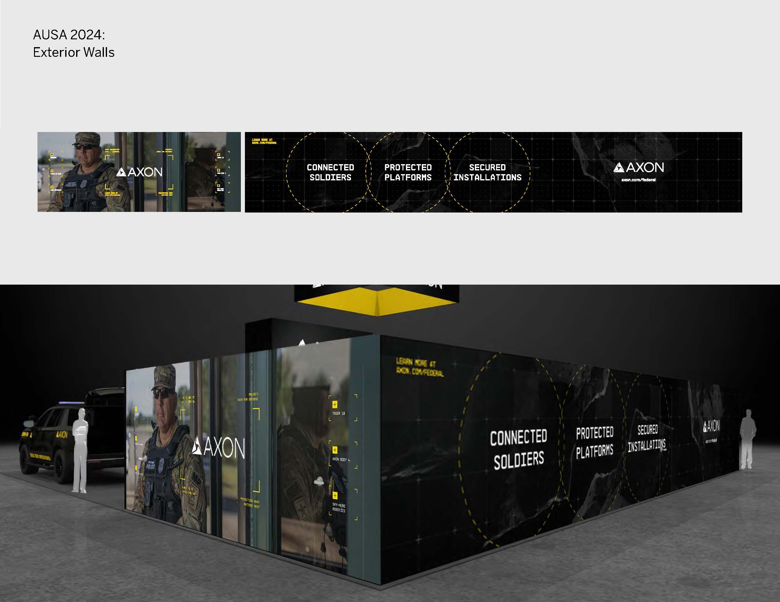
AUSA is the Association of the United States Army’s annual meeting and conference. This year, I led the ideation for Axon's booth graphics at AUSA from concept to production.
Axon is a new player in the federal space, and over the years we’ve been trying to figure out the correct visual approach for our booth that appeals to this new customer while still being true-to-brand.
After attending the conference last year, I noticed a couple insights on the major spenders at the conference like Bell, General Dynamics, Anduril, SAAB, Palantir, and US Army:
grounded applications that feel authentic to the use case. See environment fixtures like terrain, rocks, road textures in-booth. Also used in history references applied to new technology. This felt very related to imagery from the National Park system evoking Theodore Roosevelt, the Army, Mack trucks, Danner boots, a nostalgic approach to physical work and collective labor of soldiers
imagery of soldiers in the field, real-world images and video
tactical details and hud graphics
A major unexpected insight, Axon is the only company in this space that talks about less-lethality. Everywhere else, the discussion is around maximum lethality. This is a super interesting insight I never considered until I walked the space. This gives Axon a major differentiator that we have to use strategically to give us an edge, but be careful of it being “othering”.
When approaching the art direction, I was inspired my our moonshot goal (cut gun-related deaths between the police and the public by 50% in the next 10 years) and the imagery we use around it being space-adjacent and referencing mid century NASA design. I found these great high resolution floating rock images. I love that they evoke this sense of future technology and space travel, while still feeling grounded to earth. I then created hud graphics in our Axon Yellow and applied them in ways that feels accurate to our technology. Accuracy in this market is important, as customers are often subject-matter experts. This along with a grid with different opacities and background swatches made up my vector elements. I paired these assets with images we took on a video shoot we did for federal last year that demonstrated our technology ecosystem.
These elements together feels tactical, grounded, futuristic, approachable. For the VR bays, I wanted them to be bright white to have this maximum contrast impact when you entered the rooms, almost like walking on to a spaceship or a science lab. I like how the end result felt lighter and brighter than our previous showings while still feeling on-brand with our tactical black and yellow brand colors. Lots of booths go matte black for this show, so it really brightened us up in this space.
Outside of the booth we had advertising placements throughout the convention center that directed viewers to our booth. I art directed these motion graphics for our animator, adding motion here and focusing on type helped our message come across clearly and elevated our presence compared to other exhibitors.


