Real Estate Marketing and Strategy for Washington’s largest Sotheby’s International Realty office’s top producers. Branding campaigns for both real estate brokers and the properties they represent.
branding | print deliverables | social strategy | email design
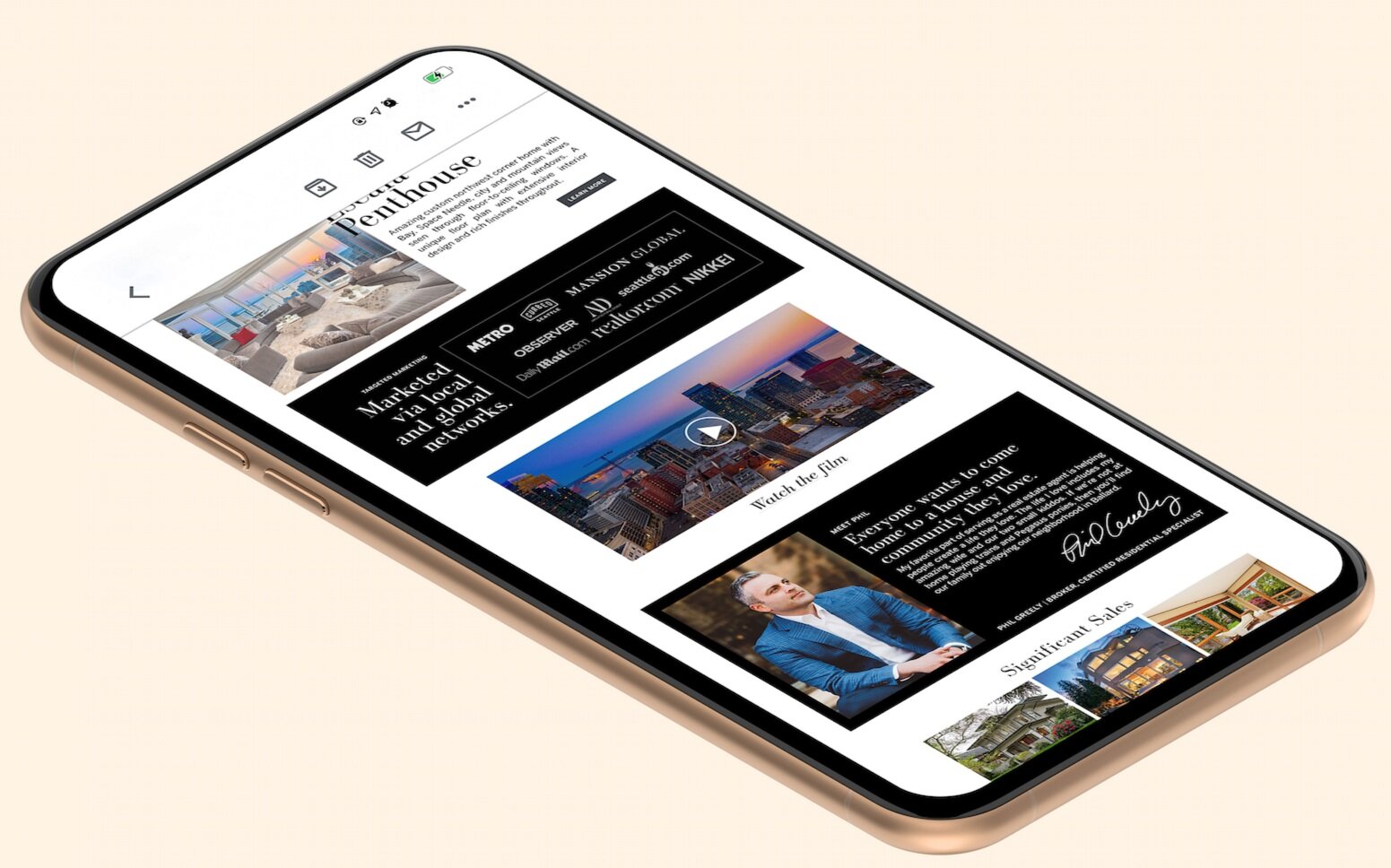
New Listing Presentation Pages and Digital Branding Templates for Phil Greely
As a top broker for RSIR Phil had invested in his personal branding through the RSIR in-house team. One of the big new elements for him were detailed newsletters and social assets to match his new Listing Presentation. I created designed templates for his assets to pass off to the social team for production.
Listing Books and Listing Presentation Publications
In order to best showcase a big ticket property some brokers opt for a detailed listing book to send to select clients or contacts. It feels exclusive, memorable, and special. Sometimes a listing book is part of the marketing deal with the seller as well, to invest a certain number of dollars into the property that go hand in hand with staging, photos, paid social, and a property website.
When trying to land a new buyer client these agents have a listing presentation created. At Sotheby’s there were different tiers of personalization available starting with a generic template to bespoke magazine-style books I’d get to create with custom photography and copy written for the agent.
Listing Sheets and Ads
Various property-specific Magazine/Print Publication Ads and Listing Detail Sheets to showcase properties.


Property Branding Pitch Format
When presenting a new logo concept, the agents I worked with always appreciated options and tonal imagery to help indicate what feeling each mark gave off. As marketers, high impact sales people, and professionals focused on deals and their clients, these agents sometimes had a disconnect when I would pitch a logo using design language only.
The process would start with an ask from the broker. I’d check in with any specific colors, style of typography they’d like to see, if they wanted it to feel true Sotheby’s branding or to stray as much as we could, if they wanted it to feel modern or elegant. From there I would create usually 6 iterations in a color and then on an image. Something to keep in mind is that these logos would primarily be used with their property photos so they had to work simply. This new pdf format I created (below) could be scrolled through on a phone in seconds and they could shoot a quick email in between showings with “option 2” and I would know what to execute with a tight turnaround time.
From there I would execute any edits they had and then flesh out the logo in usable formats for the design team when needed as well as provide the pngs to the brokers. Usually after a Property Logo creation it would go directly to marketing materials. A Broker Logo would be used on Listing Presentations and Business Cards immediately and then kept in their files until needed.


Social Content Pitch for Jay Kipp


Mailing Aquisition


